From Editor to Author
The forty years I spent editing other people’s books taught me a great deal. I have learned even more from working with the staff of Austin Macauley as they prepared my own book for printing. An editor works on a manuscript until it is correct and shipshape then sends it back to its publisher. This time I learned what happens after that, when typesetting and design begin. Vinh Tran, head of Production, told me that they had a very good typesetter, Walter Stephenson, and indeed when Walter contacted me and the process began I saw how true this was. He is an expert and has been wonderful to work with.
The first thing was to decide the page size of the book. It was to be ‘royal’, a larger size than the standard paperback and a term I hadn’t heard before. Then Walter chose the fonts that would be used after I had asked for a serif font for the body-text; he chose Sabon Next LT, a handsome font that was new to me, and Calibri, a plain sans serif font, for the seascape pages and the ‘cutaways’, as the film world would call my vignettes of life on the farm. As I had intended, the seascape pages were placed opposite each chapter opening. They were adorned by a background of swirling shapes derived from the Japanese pattern book my son Simeon had sent me. The idea was to have water-images throughout the book. Since the layout meant a few blank pages, these pages were filled with a swirl pattern derived from the same source. I am grateful to Mary-Jane Chapek for making these beautiful designs.
Next, I had the choice of lining or non-lining numerals, something I hadn’t thought about for years. The latter are the old style of numbers and are more elegant than the modern style, so I went for this. Walter instinctively distinguished between the justified body-text and the displayed quotations, which he left with the ‘ragged right’ they had in the manuscript; I have always worked with unjustified text but Walter made sense of this. He also designed the cutaways, with a justified paragraph in the sans serif font and bookended with the yinyang symbol. Other than these adornments the text flows normally.
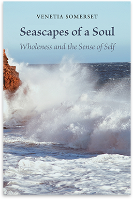
For the front cover Walter sent me some colour photos of breaking waves, and I chose one that seemed to express the clash of waves at Mona Vale beach. For the back cover he agreed to use one of Simeon’s photos, of raindrops falling on a water surface.
What has impressed me throughout this process is the expeditious and generous way Walter responded to my requests, and the patience with which he put in last-minute changes. This collaboration with an expert gave me real pleasure. I also appreciate that, because I was an experienced editor myself, Austin Macauley agreed to skip the usual in-house editorial work for this book. I have much to be thankful for.
Post Views : 130